 In the past few months I’ve been developing the art of concepting, and slowly the time between when I start a project and when it’s completed is begining to shorten. In college I’d start to panic when I narrowed in on 3 days before a project was due. Now there are times I’m given a project 30 minutes before it is sent to the printer! Of course I prefer time to ruminate on a project to produce a holistic concept or interesting imagery, but some projects simply don’t allow me take three days to leisurely flip throughly magazines or photos for inspiration! Ideas must come fast, and now I’m getting on the offensive and take my projects by storm. Concepting a great idea is the place that generally takes me, or any designer really, the most time. It’s the hardest work I will ever do on any project—and it’s mostly done in my head.
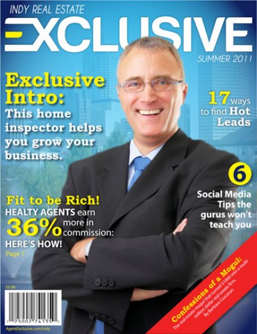
If you haven’t noticed, I enjoy a good design challenge. Concepting is often that challenge for me, and thusly the most rewarding part of any project. The image above is one of my latest projects at work. There I’m working with a team to launch the Indy Real Estate Exclusive magazine. We finally landed on a name for the publication just days ago, and it was my job to brand a logo and look for the piece. It was an exciting challenge to be sure! The word ‘exclusive’ in itself was very tricky until I began to break it apart, and I then was able to play some interesting design tricks. So many logotypes with ‘x’s’ capitalize on its inherent design as a visually strong letter, but I really wanted to avoid this. an ‘XTREME’ magazine is not quite the direction we wanted to go. Then I noticed the interesting mirror of the ‘e’s’ on either end of the word. I found that when I dropped the ‘e’s’ on either end, the word still read clearly. ‘xclusiv’ This meant that I had the freedom to abstract the first and last letters of the logo. With this in mind, I connected the e to the x at the beginning of the word and then the v to the e at the end. Our team decided this was a little too confusing to read, so I abandoned the ‘ve’ combo at the end of the word. What we landed on was an interesting connection of letters at the beginning of the word that create both an arrow shape, a house symbol (on it’s side), and a solitary element made ‘exclusive’ by the surrounding edges. In the end this word was packed full of cool ideas!
After some research and a careful choice of typeface, all this was put together in slightly less than one work day, (research, the logo, the magazine mock up, etc.) I’m happy to say that this is a vast improvement on my not-so-distant college years!
So there is a bit of my ‘behind the scenes’ for logo design. I’ll be posting more logos, as I’ve done several in recent history.
Until later!