The name of the game is keeping busy right now, and my docket is full of new and exciting work! I’ve enjoyed some brand new design horizons, and revisited some familiar projects. Most notably, I’ve been designing smartphone apps. I should have some examples I’m approved to post shortly.
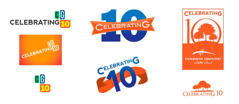
A more recent logo project I’ve completed was the Celebrating 10 logo for Common Ground Christian Church (where my husband and I worship). The church had a large gathering in Military Park in downtown Indy yesterday. The fascinating thing about logos is that they are very similar to puzzles. You are given a number of elements which have to be visually present for approval from your client, yet still maintain readability from a distance and visual simplicity. Often if your client’s list of requirements are a mile long, your logo ‘puzzle’ becomes harder and harder to solve. Below are some examples of logos I submitted before the church made their final decision.
This logo, thankfully, did not come with a long list of requirements, but it still was a bit challenging to land on a final design. My final solve reflects the biblical passage in 1 Corinthians 3:6 where the Apostle Paul says, in reference to the growth of the church, “I planted the seed, Apollos [another missionary ] watered it, but God has been making it grow.” This passage helped tie all of the elements the church wanted when promoting this event: the visual aspect of the Trinity, perhaps some trees to reflect the park we’ll be meeting in, and a focus on the ‘C’ and ‘G’ in ‘celebrating.’ (also in Common Ground) and also a slight ‘retro’ feel. All of these elements were featured, but I believe proper emphasis was placed on the growth of the church into maturity.
Logos are truly amazing in that, with one or two little marks or pictures, so much can be said. They will remain something I will always need to practice, and forever be in awe of!


I like it!! Way to go, Mandie!
Love you!